
Case study
Funnel Dashboard
Sales and marketing data from four different tools, stitched into one funnel you can actually read.
- Industry
- Sales and marketing analytics
- Year
- 2023
- Timeline
- About three months
- Services
- Front-end engineering, Data visualisation, UI design, Data integration
- Stack
- ReactJS, Redux, Material UI, HTML/CSS
What changed
- CRM, email and social data pulled into one funnel view
- Stage-by-stage conversion visible without building a report by hand
- Teams stopped rebuilding the same spreadsheet at the start of every week
Numbers available under NDA on request.
We built a funnel dashboard for a sales and marketing team that had good data in the wrong shape: spread across several tools, none of which talked to each other.
Overview
The company runs its pipeline through a CRM, an email platform and a couple of social channels. Each one reports on its own slice. What nobody had was a view of the whole funnel, from first touch to closed deal, in one place, updated as things happened.
The problem
Every stage of the funnel lived in a different system with a different definition of a “lead”. Pulling it together meant a manual export and merge, usually done once a week by whoever drew the short straw. By the time the numbers were assembled they were already a few days old, and the effort of assembling them meant nobody looked more often than they had to.
The result was a team that could tell you last week’s conversion rate but not this week’s, and could not easily see which stage was leaking.
Our approach
We agreed a single definition for each funnel stage up front, so the same lead counts the same way everywhere. Then we built connectors that read from each source on a schedule and normalise the data into that shared model.
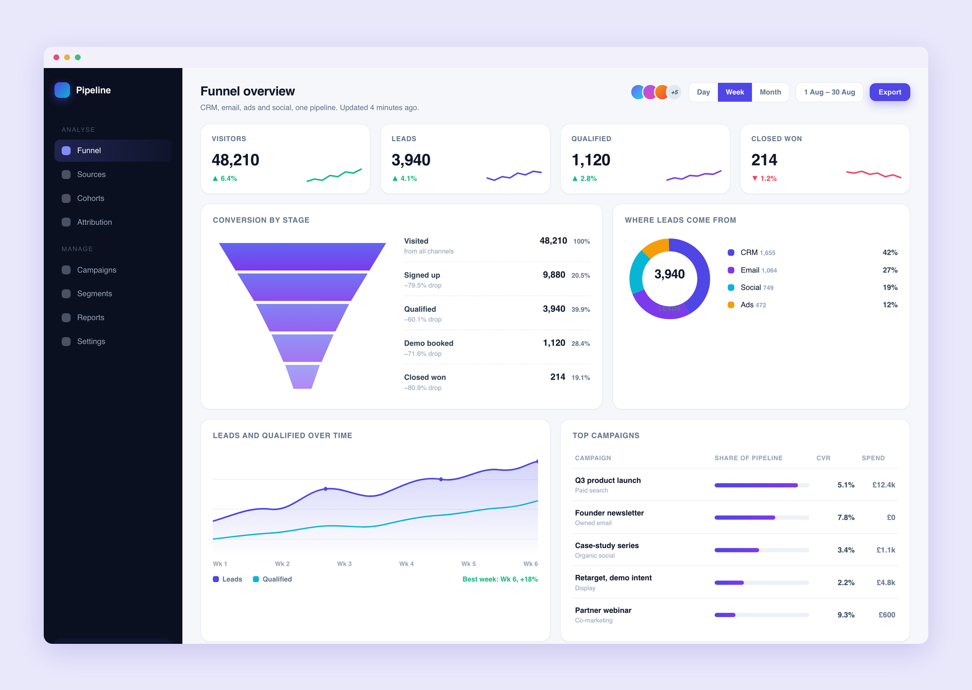
On top of that sits a React dashboard with Material UI, designed to be read at a glance: the funnel as a shape, conversion between each stage, and the ability to open any stage to see what is in it right now.
What we built
- Integrations that pull from the CRM, the email platform and social channels into one normalised pipeline.
- A funnel view that shows volume and drop-off at each stage, refreshed automatically.
- Stage-level detail, so “we are losing people between demo and proposal” comes with a list of who and when.
- Saved views for the metrics different people check regularly.
The outcome
The weekly spreadsheet ritual went away. The team can see conversion for the current week, not just the last one, and can point at the stage that needs attention rather than guessing. Decisions that used to wait for the Monday export now happen when the data changes.