
Case study
Halal music licensing platform
A vocals-only music library, from the marketing site to licence-and-download, built as the front-end on an API another team owned.
- Industry
- Music licensing
- Year
- 2024-2025
- Timeline
- About a year
- Services
- Front-end engineering, UI/UX design, Design system
- Stack
- Next.js, TypeScript, Tailwind CSS, Wavesurfer.js, Stripe
What changed
- The full platform front-end shipped: marketing site, catalogue browse and the licence-and-download flow
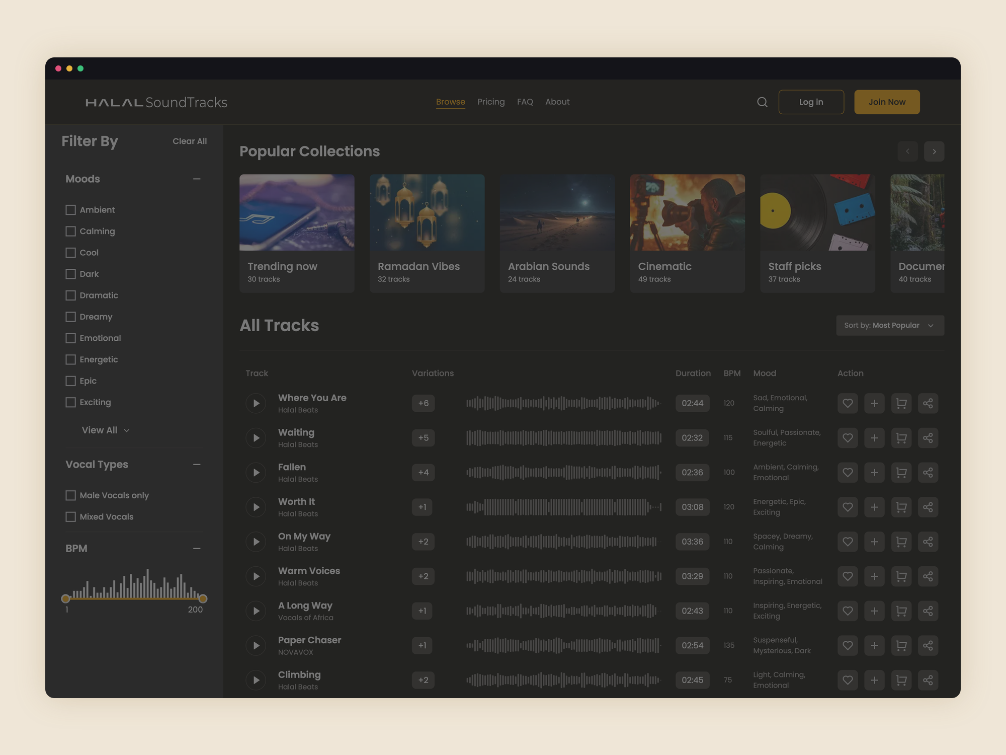
- A custom waveform player for previewing tracks, with filters for mood, category and vocal type
- Stripe checkout wired into licence selection, so track to receipt is one path
- A design system the client's team keeps building on
- Delivered to what the client set out to make, and the platform is live and in use
Numbers available under NDA on request.
A licensing platform for halal soundtracks: vocals-only tracks, with an optional daf, that content creators can preview, license and download. We designed and built the whole front-end, from the marketing pages to the browse experience and the checkout, working to an API another team owned.
Overview
The product sits in a gap. Editors and videographers who want faith-friendly audio were choosing between library music full of instruments and nasheeds that did not fit the cut. This platform offers a catalogue of vocals-only tracks, sorted by mood, category and vocal type, with a licence and a download at the end. Our job was everything the user sees and touches.
The problem
The client had a backend team building the catalogue, accounts and licensing API, and a clear idea of the product, but no front-end and no design. Starting from that:
- Nothing to design against. There were no screens, no components and no visual language, only a brief and references.
- Audio is the product. Browsing a music library is mostly listening. The preview player had to be quick to reach, quick to scrub, and out of the way once a track is playing.
- A licence is a real transaction. Choosing a licence and paying for it had to feel as considered as the rest of the site, not a bolt-on checkout.
- One team, many surfaces. Marketing pages, a catalogue, collections, an account area and a checkout, all needing to look like one product and stay maintainable by a small team.
Our approach
We designed the interface from scratch alongside the build, in short loops with the client, so decisions were made against working screens rather than mockups. Early on we set a small design system: type scale, colour, spacing, and a set of components that both the marketing pages and the app draw from. That is what lets the team add a landing page or a collection now without re-deciding the basics.
For preview we built a custom player on Wavesurfer.js: a waveform you can click to scrub, one active track at a time, and controls that stay put as you move through results. Catalogue browse is filter-first, with mood, category and vocal type (male vocals only, mixed, vocals and daf) as the axes people actually think in.
The whole thing is Next.js and TypeScript with Tailwind for styling. Every screen reads from the client’s API: we owned the front-end contract and the experience, they owned the data and the licensing logic. Payment is Stripe, wired into the licence-selection step so the path from a track to a receipt is continuous.
What we built
- The marketing site: home, about, pricing, FAQ and the supporting pages, all on the shared component set.
- Catalogue browse and collections, with the waveform preview player and filter-first navigation.
- The account area and the licence-and-download flow, with Stripe checkout.
- A design system the client’s team continues to build on.
The outcome
The platform is live and in daily use by content creators. The client got the product they set out to build, on the stack they wanted, and the front-end is theirs to extend. It has stayed a straightforward codebase for a small team to run.