
Case study
Smart Sense Dashboard
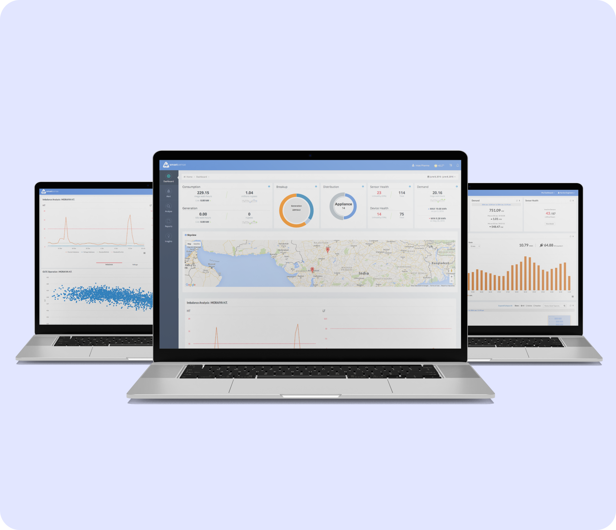
One screen for a whole plant's energy: live consumption, on-site green generation and diesel backup, asset by asset.
- Industry
- Energy and industrial IoT
- Year
- 2023
- Timeline
- About four months to first release
- Services
- Front-end engineering, Data visualisation, UI/UX design, IoT data integration
- Stack
- AngularJS, JavaScript, Highcharts, HTML5, CSS3, XML and JSON APIs, Google Maps
What changed
- Grid draw, on-site generation and diesel backup on one live screen
- Per-asset readings for transformers, motors, chillers and other equipment
- Operators can spot a consumption spike without exporting anything to a spreadsheet
Numbers available under NDA on request.
SmartSense is an energy monitoring product for large industrial sites. We built the dashboard that plant operators actually look at: a single view of how much power the site is pulling, how much it is generating for itself, and where every unit is going.
Overview
The plant runs a mix of grid supply, on-site renewable generation and diesel generators for backup. Hundreds of pieces of equipment draw power around the clock. The data existed, sitting in the SmartSense platform, but there was no clear way to see the whole picture at once or to drill from “the site is using more than usual” down to “it is the chiller on line two”.
We were brought in to design and build the operator-facing dashboard on top of the platform’s APIs.
The problem
Energy teams were working from periodic reports and raw exports. That meant three things got in the way:
- No live picture. By the time a report was compiled, the moment to react to a spike had passed.
- No path from summary to cause. A high daily total told you something was wrong, but not what.
- Renewables and backup were invisible. The value of the on-site solar, and the cost of the diesel generators kicking in, were buried in the same numbers as everything else.
Our approach
We started by sitting with the people who would use this every day and mapping the questions they ask in order: is the site normal right now, is that good or bad compared to usual, and what is driving it. The dashboard is built around answering those three questions from top to bottom.
We chose Highcharts for the time-series and gauge views because the team needed dense, readable charts that hold up when you are watching them on a wall display. Everything reads from the platform’s XML and JSON APIs, with a Google Maps layer for equipment that is spread across the site.
What we built
- A live overview: current grid draw, on-site generation and generator load, with the split shown clearly rather than rolled into one figure.
- Asset-level tracking for transformers, motors, chillers and other equipment, so a total can be opened up to see which units are responsible.
- Trend views that compare the current period against the site’s own history, so “high” always has something to be high against.
- A map view for locating equipment quickly when something needs attention on the ground.
The outcome
The plant’s energy team moved from reading yesterday’s report to watching today’s numbers. Consumption spikes get noticed while they are happening, the contribution from renewables is finally visible next to everything else, and questions that used to mean a spreadsheet export now take a couple of clicks. SmartSense is used across industrial plants and manufacturing facilities that want tighter control of what they spend on power.